
East London Liquor Company has launched its first blended whiskey, with packaging designed to reflect not only the character of the product but also the place. Designed by Glasgow- and New York-based firm Thirst, East London Whiskey’s bottles deliberately eschew the windswept coastline visual language that has long defined the category, replacing it with something louder, more layered and gritty.
As Thirst describes it, the brief was deceptively simple: create a disruptive design for a new blended grain whiskey that would sit confidently at an affordable premium and feel like good value for money in the hand. The challenge was to convey quality without resorting to the usual signals of tradition and restraint. In my opinion, this is a lot of brown woodland creatures and serif fonts. As Sam Cutler, Thirst’s creative director, says: “Whiskey feels like it’s trapped in old-world notions of quality. It needs to feel worthwhile without becoming precious.”
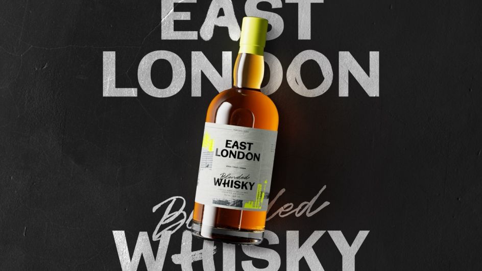
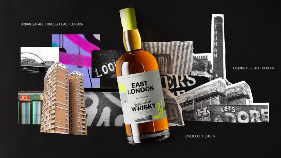
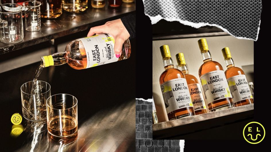
The creative strategy developed by Thirst – which they call “Exquisite Clash” – draws directly on East London’s urban character: the old pub sits next door to the New World restaurant, Victorian details sit alongside the concrete tower, and layers of history evolve. This cultural tension became the engine of the visual identity, which favors vast amounts of contrast, texture and contemporary energy over any idealized notion of provenance.
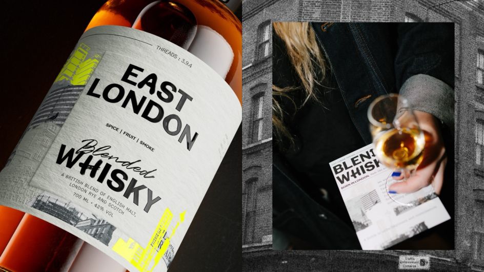
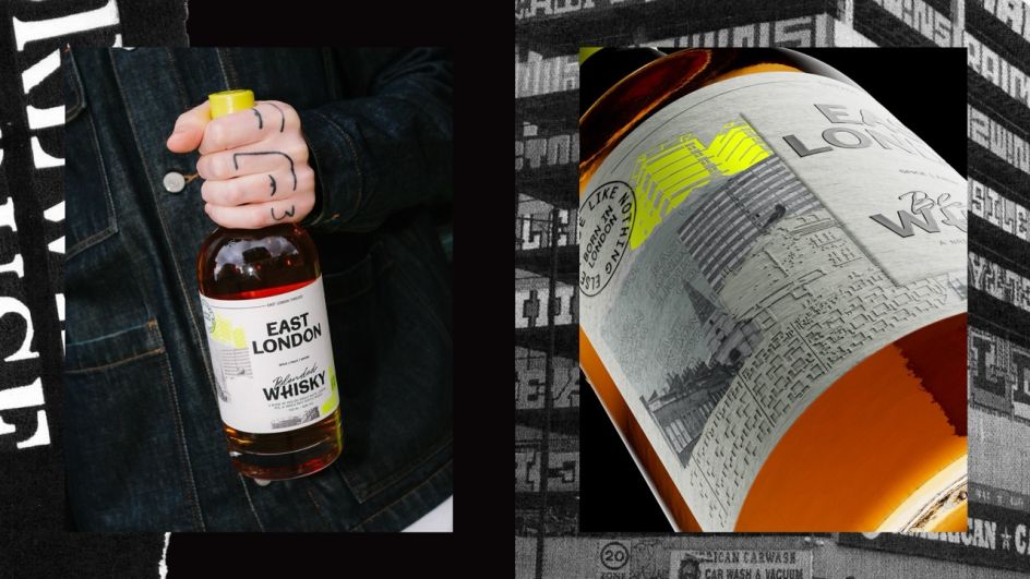
Research goes beyond the usual mood boards. Senior designer Alex Page and the client spent a day on an “urban adventure” across East London, photographing overlooked textures, signage, typography, architecture and the “unexpected beauty of everyday life”. Subsequent materials all feed directly into the final execution, which is deliberately tactile and three-dimensional: embossing, micro-embossing, flecked varnish, foil details and die-cut shapes combine bold printed structures with collage-like layering and bursts of neon energy.
The result is a product design that works at two distances…from across the bar, you can see it immediately. In hand, it deserves closer attention, answering the unspoken question a shopper might ask on the shelf: why is the £42 bottle worth it? The designers believe that this value is not achieved through false tradition; It is built through matter and craft.
Customers are happy too. Alex Wolpert of East London Liquor said: “The development of creative strategy is where Thirst’s expertise really shines – a healthy questioning of the fundamental DNA of East London Liquor.”
The launch marks a significant expansion of East London Liquor Company’s whiskey credentials, bringing its signature flavor-first philosophy to a wider audience and cementing the distillery’s strong reputation. Backed by a program of events and events across London, the launch has generated a strong response so far, boosting sales of the whiskey and building a more confident platform for the next chapter.
This was the kind of brief any discerning studio would snap up. Thirst was so happy to design an identity for a product so tied to its heritage and status that any of the usual signals of premium were meaningless.


