
There is a version of the Clemens Chocolate Project that has never been reported. In this edition, MELT Design takes a brief look at artisanal organic chocolate, employing a common vocabulary (warm browns, botanical illustrations, a tasteful nod to Brazilian heritage) and delivering something competent, beautiful and completely forgettable. The customer is very satisfied. The work disappears from the bookshelf.
In fact, that version didn’t happen. Instead, a small studio in Campinas, Brazil asked enough questions to reveal one of the more compelling backstories in recent packaging design, and then boldly used it all.
The story behind the story
Clemens is an artisanal chocolate brand using premium organic Brazilian cocoa, and when customers come to MELT, they have a clear goal. More creative packaging can convey the irreverence and quality that defines the brand. It was a pretty standard briefing, to be honest. But studio co-founders Juliana and Marjorye, who lead MELT, pressed further.
“Through the dialogue with the client, we discovered an extraordinary story,” says Ana Luíza of MELT Design. “The name of the brand is a tribute to the owner’s grandfather, whose migration journey from Siberia to Brazil has become the subject of a book.”
This statement alone is worth pausing. A brand name is not a founder’s name repurposed for glamour, nor is it a word chosen from a mood board. This is a tribute to a specific person who lived an extraordinary life. One man left Siberia and spent nearly ten years coming to Brazil, arriving in 1933. His adventures were so numerous and vivid that they decided to publish them.
MELT obtained a copy.
What did the book give them?
This is where this project becomes truly instructive for any creative thinking about the relationship between research and originality. At this point, the brief basically wrote itself… but that’s only because the studio did the work of finding it.
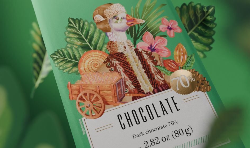
MELT immerses itself in text, identifying characters, scenes and objects that have emotional weight. A goose represents the happiest moment of my grandfather’s life. A Russian coat kept him warm in the harsh winter. A snake that scared him during his travels. The place where he camped was a pine forest. A jaguar passed in front of him.
These are not mood board references or stock illustrations. They are concrete things taken from a person’s life experience, filtered through a book, and now transformed into the packaging of a chocolate bar.
“We are immersed in this story filled with characters, settings and elements that shaped Clemens’ childhood and youth,” says Anna Luisa. “Then we decided it would be incredible to bring them to life with new packaging.”
what they created
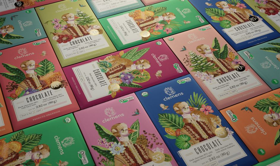
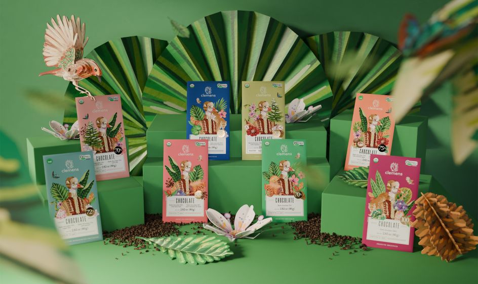
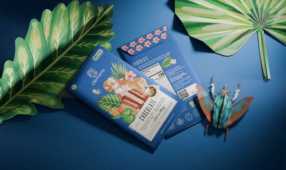
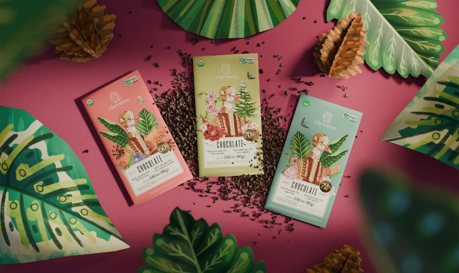
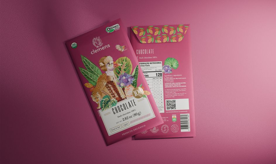
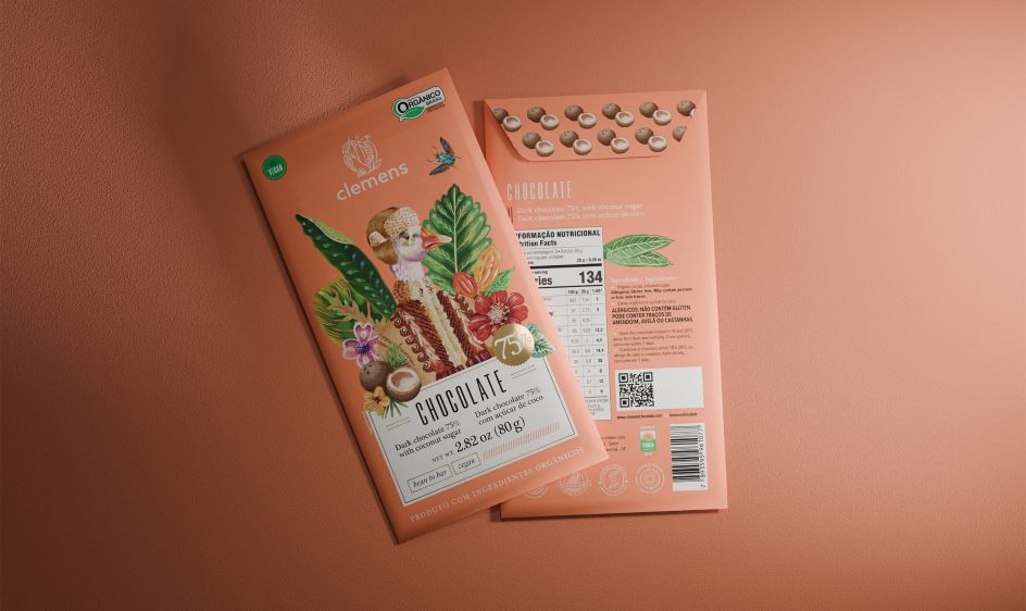
The resulting illustrations are bold and full of character; loose, expressive brushstrokes give each character presence without falling into the flat precision of contemporary food brands. Each chocolate bar in the range features different ingredients that are also incorporated into the composition, meaning each product has its own specific visual universe. No two bars are the same. This phenomenon created by the collector’s instinct is no accident.
What makes the work visually consistent and gives it its unique energy is the collision at its core. This is a story about a world conference in every sense of the word. Siberia and Brazil. Russia and Tropical South America in the 1920s. European immigration and Amazonian composition. The packaging truly reflects this collision, blending the warmth and vibrancy of Brazilian colors with imagery clearly rooted in a cooler, older, more European world.
Jaguars share visual space with Russian coats. Tropical flora forms the frame of pine trees. It shouldn’t work, but it does because the logic behind it is not aesthetic but biographical. These things originally belonged to one person’s life, and now they appear together on the shelves of the same brand.
As Ana Luíza says: “The result is an outstanding portfolio that effectively communicates the brand’s unique personality, incorporating elements and culture that can only come together in a surprising story like this.”
lesson
For creative professionals, the Clemens project is a useful reminder that the most original work rarely comes from the first presentation of a brief. It comes from asking what lies beneath. Customers know they have a good product. They know that brand names have personal meaning. Before the MELT starts asking questions, they may not fully understand how much of the story they already know.
That’s the trick. Not the illustrations, not the color palette, not the typography (although all of that is beautifully executed). But realize that the most powerful design direction is hidden in a book about someone’s grandfather, and be curious enough to actually read it.


