
There’s a creative challenge that doesn’t get discussed enough: What do you do when you’re designing for a category that’s so visually established that it feels almost radical to break out of it?
That’s exactly what José Manuel Vega sets out to solve with NFUZD, a cannabis-infused soda brand that wants nothing to do with the usual aesthetic script. No giant green fonts or obvious symbols, just unexpected colors and joy.
Vega is a brand designer currently based in the UK, although his story is by no means local. Over the past 12 years, he has lived and worked in Germany, the United States and Spain, enjoying a mobile creative life and quietly shaping a truly international approach to design.
He studied at the University of Malaga but discovered his passion for the craft while studying abroad for a year in Stuttgart. He will tell you that hip-hop has a huge influence. You can definitely feel it in the work: bold, direct, culturally fluid.
With NFUZD, his customers are willing to go to different places, and he goes with them. The dream brief that everyone wants. But when Vega considered the cannabis category, he realized it often defaulted to a familiar visual language: earthy tones, hand-drawn plants, overused script fonts. “It’s not that these don’t work,” he explains, “but they’ve become a visual shorthand that prevents brands from launching anything new.” As you might expect, NFUZD isn’t interested in blending in.
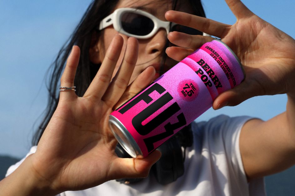
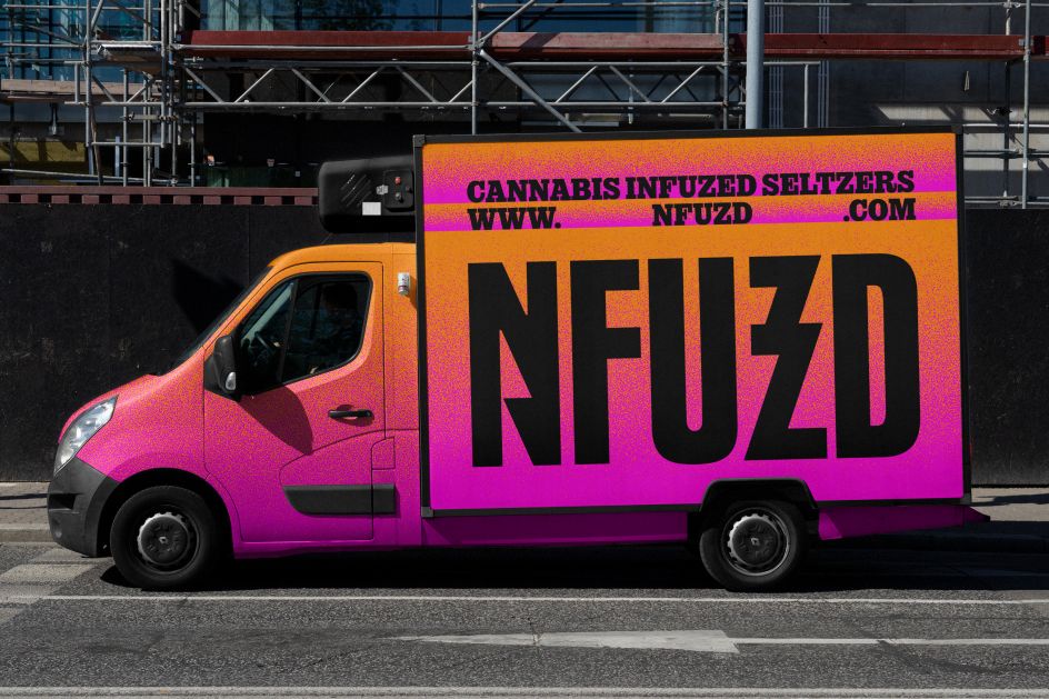
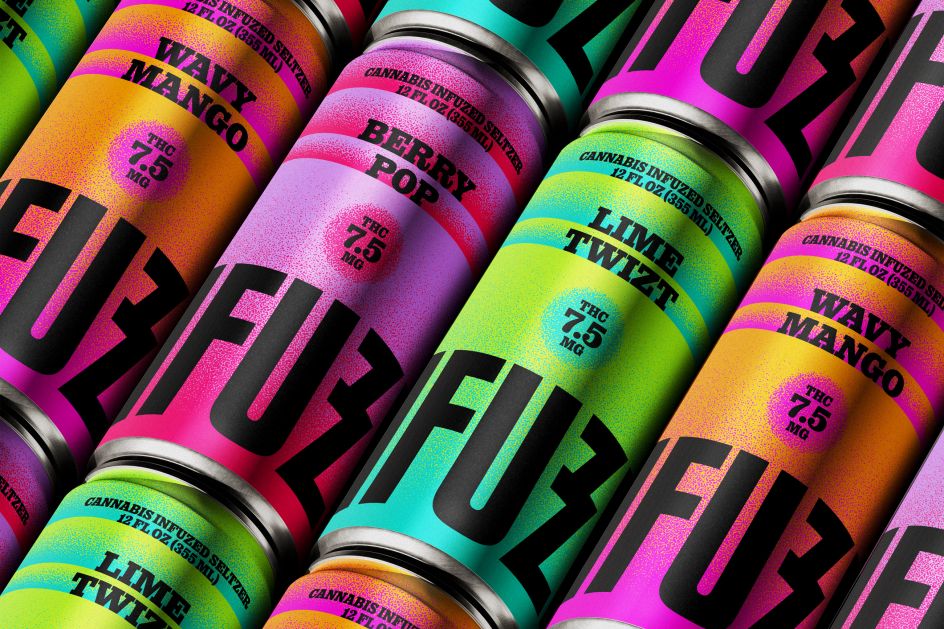
Instead, Vega looked to the ’80s and ’90s for inspiration—an era that understood maximalism in a way that still felt exciting rather than exhausting. Think saturated color palettes, layered gradients, and subtle textures that evoke both the sparkle of sparkling water and something more sensual. Vega’s final color system is vivid but controllable; the real trick is knowing how many bright colors you can keep before things fall apart.
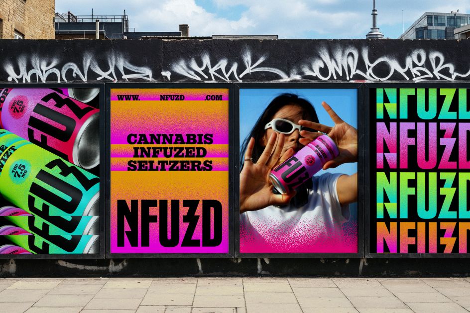
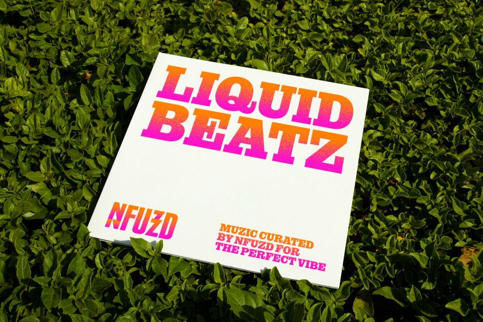
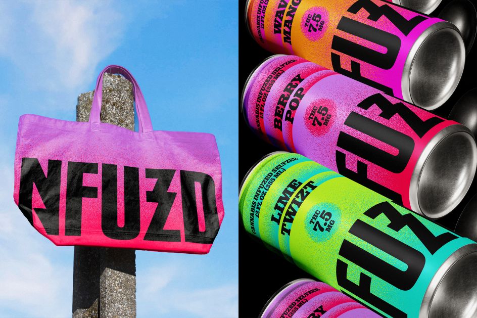
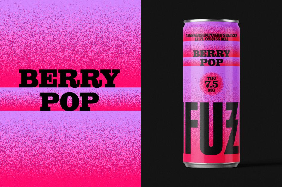
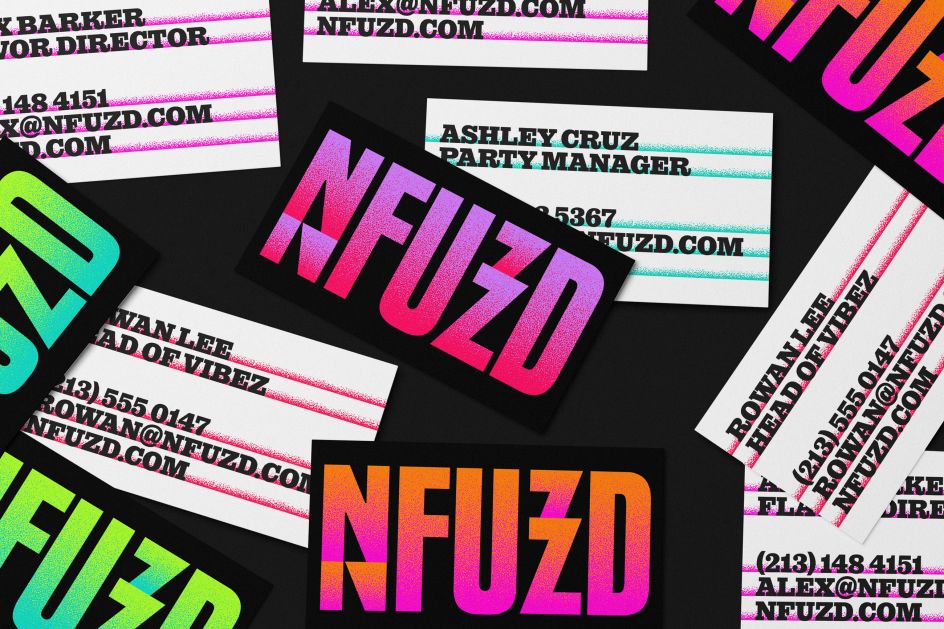
The typography is retro, but in the best way. The main font has an authentic character and fits naturally into the gradient world Vega has built around it. The logo itself also embodies the spirit of the ’90s rock band: bold enough to be read from a distance, with visual variation built into certain letterforms that quietly pay homage to the product’s effect without having to spell out anything. It’s confident and a little rebellious, perfect for a brand that calls itself “the life of the party.”
However, what’s special about this project isn’t just the execution; This is the idea behind it. Vega set out to prove that cannabis brands could be colorful, engaging, and rooted in pop culture without relying on tired visual clichés. At its core, NFUZD isn’t really about selling drinks. What is sold is a feeling. Vega translates this emotion into something you can actually see and hold.
This is no small thing when we are all feeling exhausted and overstimulated from too many choices and information. Vega himself believes that a brand should be an “oasis where the eyes want to rest and stay.” With NFUZD, he does this very well; only the oasis of his imagination is neon.


